This book, Pictorial Composition and the Critical Judgment of Pictures, by Henry Rankin Poore and written in 1903 is one of the most brilliantly written books I have come across. It is a subject about which many artists lack knowledge and thus struggle with their work, simply because it was information they were never taught. Originally written, as many books from that time were, with a more eloquent and decorative speech, something many folks may find difficult to wade through. I will be attempting to translate the dialogue in the book into something you may find easier to read – hopefully without losing too much in the translation. It is a book you can find on-line or as an E-book. Some of the pictures he references in the book I will try to re-source since the scans of the original may be suboptimal.
RESERVE.
A spin-off of simplicity is Reserve. In the simple statement of the returning Roman general: “I came, I saw, I conquered,” all the senate desired to know was stated and it gained force by virtue of what was left unsaid. Anything else might have made satisfied the curiosity of the assembly, but the man, in holding this secret, made himself an object of interest. Rembrandt has shown us through his paintings that anything which can be expressed doesn’t require us to travel all the way into the deepest dark or the highest light of our palette, but some distance from these extremes. Expression through limitations is dignified, unlike straining to reach these outer limits of paint sacrifices that dignity. It is the force so quickly squandered by the young actor, who “overacts,” disturbing the balance of forces in the other parts.
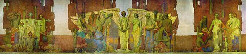
Jules Guerin Lincoln Memorial
The idea of Reserve falls exactly mid-way between the contentious ideologies spouted by the Impressionists and the Tonists. The Impressionists would keep the gas pedal to the floor from start to finish; the Tonist prefer the “Waiting Race” with every atom of force governed and in control, held for that moment when increasing strength is necessary. It is the difference between aiming at the bull’s-eye or the whole target.
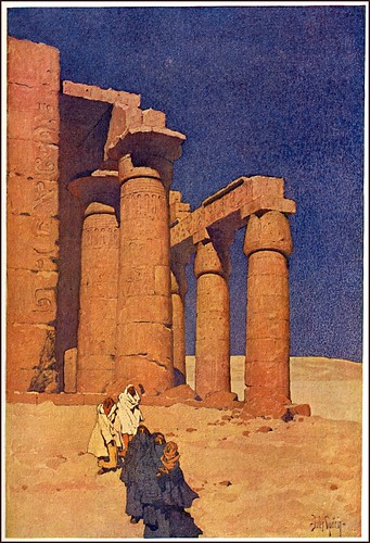
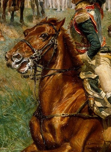
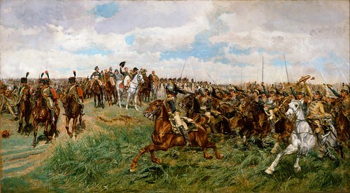
Jules Guerin Egypt
Reserve can also be demonstrated by the recent tendency of illustration to produce a picture in three or four flat tones. In the new movement within decorative art one can observe these ideas within it. In the work of Jules Guérin it is interesting to note how the controlling ideas of these two factors of breadth (simplicity and reserve) have been applied to every stroke, now and then only, detail being allowed its say, and only in a small voice.
With the large number of pictorial ideas now being recast in the decorative formula, it has become necessary to have a clear notion of the purpose and limitations of decorative art. It is far too easy to misunderstand this new art or to confuse it with the purely pictorial.
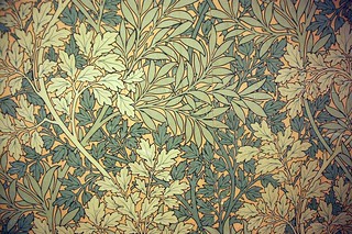
William Morris wall paper
Decoration is essentially flat. It represents length and breadth. It applies primarily to the flat vertical plane. It deals with the symbols of form, with fact by suggestion, with color in mass. It substitutes light and dark for nature’s light and shade. They are ideas which are only arranged on a flat vertical plane (picture plane). Classically, they might be the heraldic designs on shields where the natural fact is secondary to the happy adjustment of spaces. Nature, to the decorative mind, presents a varied pattern from which they can clip any shape which the color design demands.
Some designs by Arthur Wesley Dow
The influence that decorative design has brought into pictorial art something which has never been classified.
The different decorative ideas have intermixed and have been nurtured and matured through history and grown into the art nouveau movement. The seed of decoration has been suddenly transplanted into the garden of pictorial art. There was hardly room in this garden for these newer things, but somehow they were able to elbow out some space for themselves.
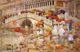
Prendergast
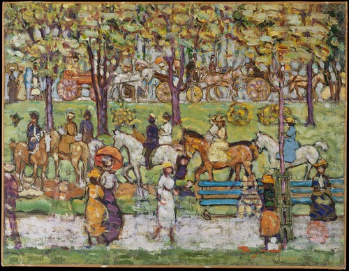
It is difficult, for instance, to reconcile the crowded and spotted surfaces in Mr. Maurice Prendergast pictures, to the rules of balance in pictures. It has to be recognized however, that their main claim to attraction is their color, which is usually a harmony in red, yellow and blue. When the crowds of people or buildings do not form balanced combinations, they often fill the canvas leaving excellent spaces. These spaces are even more commanding because of their isolation than the groups choking the edges of the canvas. Most often though these crowds can be found to hang most beautifully on a natural axis and to comply with all the principles of pictorial structure.
Met museum says about Central Park: “Prendergast captured the park’s festive energy on a summer day and suggested, with broad horizontal bands, the tripartite traffic system that accommodated carriages, horses with riders, and pedestrians. The painting, once titled “Central Park in 1903,” may have been begun in that year and later reworked. It shows women in the types of dresses and hats that were stylish in 1903 and horse-drawn carriages as opposed to the automobiles and bicycles that appeared shortly thereafter. Prendergast’s dense pigments, juxtapositions of complementary colors, and whirls of form indicate the influence upon him of contemporary Synchromist painting.”
“Central Park” M. Prendergast
In his park scene, showing several tiers of equestrians one above the other, the chief charm is the idea of continuous movement which the scene conveys. The detail, wisely omitted, if supplied would stop the movement and hold the attention challenging the feeling of motion. It would then be found that what we accepted as an impression of a nature being perceived by another, we would demand more of as a finished picture. It is because it is more decorative than pictorial and because its pictorial parts are rendered by suggestion, that it makes so winning an appeal.
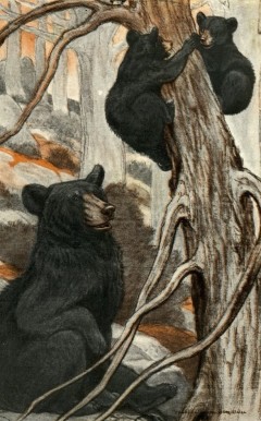
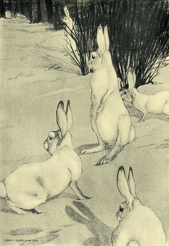
Charles Livingston Bull
The quaint and fascinating concepts of Charles Livingston Bull in the range of animal drawing and painting are all struck in the stamp of this new mold. There is an ever growing list of able illustrators whose work shows the principles of reserve.


_(14779195811).jpg)

_(14587294250).jpg)
