Pictorial Composition and the Critical Judgement of Pictures – ChapXI

This book, Pictorial Composition and the Critical Judgment of Pictures, by Henry Rankin Poore and written in 1903 is one of the most brilliantly written books I have come across. It is a subject about which many artists lack knowledge and thus struggle with their work, simply because it was information they were never taught. Originally written, as many books from that time were,  with a more eloquent and decorative speech, something many folks may find difficult to wade through. I will be attempting to translate the dialogue in the book into something you may find easier to read – hopefully without losing too much in the translation. It is a book you can find on-line or as an E-book. Some of the pictures he references in the book I will try to re-source since the scans of the original may be suboptimal.

CHAPTER XI – THE PLACE OF PHOTOGRAPHY IN FINE ART

Note: I am going to place this here exactly as it is written since it is deals with something I have rather strong feelings about. Few photographers have studied the principles which we have been looking at, and therefore I find the vast majority of photographs to be sophomoric at best. When done well however, a photograph can certainly be artistic.

Since the time that photography laid its claim to be reckoned among the fine arts the attention of artists has been attracted first by the claim and thereafter, with acknowledgments, to the performance.

The art cry of the newly baptized had the vehement ring of faith and determination. Like the prophecy of the embryo premier it sounded: “My lords, you will hear me yet.”

The sustained interest of the “Photographic Salon” and the utterance of its exhibitors in the language of art, has long since obtained concession to the claim for associate membership. To make this relationship complete became the effort of many writers of the photographic circle. “The whole point then,” writes Prof. P. H. Emerson, B. A., M. D., of England, “is that what the painter strives to do is to render, by any means in his power, as true an impression of any picture which he wishes to express as possible. photographic artist strives for the same end and in two points only does he fall short of the painter—in color and in the ability to render so accurately the relative values, although this is to a great extent compensated by the tone of the picture. How then is photography superior to etching, wood-cutting, charcoal drawing? The drawing of the lens is not to be equaled by any man. There is ample room for selection, judgment and posing, and, in a word, in capable hands a finished photograph is a work of art. Thus we see that the art has at last found a scientific basis and can be rationally discussed, and I think I am right in saying that I was the first to base the claims of photography as a fine art on these grounds and I venture to predict that the day will come when photographs will be admitted to hang on the walls of the Royal Academy.”

Since the appearance of the above which comes as close to the real reason in question as its logic might intimate, but which is worth quoting from the prophecy which it contained, there have been many expressions of opinions by photographers. None, however, are more to the point than the following from the pen of Mr. F. H. Wilson: “When, fifty years ago, the new baby, photography, was born, Science and Art stood together over her cradle questioning what they might expect of her, wondering what place she would take among their other children. Science soon found that she had come with her hands full of gifts and her bounty to astronomy, microscopy and chemistry made her name blessed among these, her elder sisters. Art, always more conservative, hung back. But slowly jealous Art who first frowned and called the rest of her brood around her, away from the parvenue, (social climber, upstart, or non-entity) has let her come near, has taken her hand, and is looking her over with questioning eyes. Soon, without doubt, she will have her on her lap with the rest.”

“Why has she been kept out so long? Almost from the beginning she claimed a place in the house beautiful of art. In spite of rebuffs she knocked at its doors, though the portrait painter and the critic flung stones at her from the house-top, and the law itself stood at the threshold denying her entrance. Those early efforts were not untinctured with a fear that if she should get in she would run the establishment, but the law long since owned her right, and instead of the crashing boulders of artistic dislike and critical indignation the volleys they drop at her feet now are mere mossy pebbles flung by similarly mossy critics or artist-bigots. Still, the world at large hears them rattle and does not give her the place and estimation she has won.”

“Art began with the first touch of man to shape things toward his ideal, be that ideal an agreeable composition, or the loftiest conception of genius. The higher it is the more it is art. Art is head-and-hand work and a creation deserves the name of art according to the quality and quantity of this expended on it.
Simply sit down squarely before a thing and imitate it as an ox would if an ox could draw, with no thought or intention save imitation and the result will cry from every line, ‘I am not art but machine work,’ though its technique be perfection. Toil over arrangement and meditate over view-point and light, and though the result be the rudest, it will bear the impress of thought and of art. I tell you art begins when man with thought, forming a standard of beauty, commences to shape the raw material toward
it. In pure landscape, where modification is limited, it begins when the artist takes one standpoint in preference to another. In figure composition, where modification is infinite, it begins with the first touch to bring the model into pose. When he bends a twig or turns a fold of drapery the spirit of art has come and is stirring within him. What matters the process! Surely it is time that this artistic bigotry was ended.”

The kernel lies in the sentence “when he bends a twig,” etc. “the spirit of art has come.” In other words when he exhibits choice and preference, when, in short, he composes. Recognizing that composition was the only portal through which the new candidate for art recognition could gain an entrance into the circle of Art, the single effort of the past photographer, viz.; the striving for detail and sharpness of line, has been relegated to its reasonable place. A comprehension of composition was found to demand the knowledge of a score of things which then by necessity were rapidly discovered, applied and installed. Composition means sacrifice, gradation, concentration, accent, obliteration, replacement, construction of things the plate does not have, destruction of what it should not have.

Supplied with such a magician’s wand no effect was denied: all things seemed possible.

Gratified by recognition in a new realm the new associations should be strengthened. Whereas photography had been spanned by the simple compass of Mr. and Mrs. A. and their daughter, in figures; or topographical accuracies in landscape, revelers in the new art talked of Rembrandt and Titian, Corot and Diaz. To do something which should put their art in touch with these, their new-found brethren, was the thing! A noble ambition, but only a mistaking of the effect for the cause. These men composed. The blurred outline, the vacant shadow, the suppressed corners, the clipped edges. This all means composition in the subduing of insistent outline, in the exchange of breadth for detail, in the centralization of light, in the suppression of the unnecessary.

But no, the employment of these devices of the painter from the photographer’s point of view of composition is not sufficient. Photography is now busy complimenting every school of painting under the sun. Yesterday it was Rembrandt’s school. Now that is passed, and Carrière is better and tomorrow, perchance, it will be Raphael or Whistler or some Japanese, why not?

The one and only good sign which marks imitation is that it shows appreciation, and this of the standards is a good thing. Let each have its turn. Their synthesis may be you.

But to a man of the professions or business whose time for study in these vast fields of the classics is so disproportionate to their extent and who, though supplied with search warrants and summons, still fails to make a capture, how ineffectual and wearying this chase after ideals—subjective. Why not shorten your course? Why not produce Rembrandts and Corots because you apprehend the principles on which they work and anticipate a surprise in discovering, as by chance, that you have produced something which recalls them. In this way and by these means there will be meaning in your claim of brotherhood.

One may scarcely call an estimate in art matters complete without an opinion from Mr. Ruskin. “In art we look for a record of man’s thought and power, but photography gives that only in quite a secondary degree. Every touch of a great painting is instinct with feeling, but howsoever carefully the objects of
a picture be chosen and grouped by the photographer, there his interference ends. It is not a mere matter of color or no color, but of Invention and Design, of Feeling and Imagination. Photography is a matter of ingenuity: Art of genius.”

On these lines however the philosopher of Coniston hardly proves his case.

Invention and design, feeling and imagination, are all a part of the photographer’s suite. He employs them all. And these too are qualities the most artistic. Technique, which is manual and not spiritual, is the one point at which art and photography cannot coalesce. To Art’s sentient finger-tips, Photography holds
up only steel, wood and glass. Art therefore holds the winning cards.

P. G. Hamerton, England’s safest and surest critic of art, writing a generation ago on the “Relation between Photography and Painting,” says: “But all good painting, however literal, however pre-Raphaelite or topographic, is full of human feeling and emotion. If it has no other feeling in it than love or admiration for the place depicted, that is much already, quite enough to carry the picture out of the range of photography into the regions of real art.”

“And this is the reason why good painting cannot be based on photography. I find photographic data of less value than hasty sketches. The photograph renders the form truly, no doubt, as far as it goes, but it by no means renders feelings and is therefore of no practical use (save for reference) to a painter who feels habitually and never works, without emotion.”

It is very much to be questioned if Mr. Hamerton in the face of what has since been done with the camera by men who feel and are led by the emotional in art, would claim a distinction to the painter and deny that the photographic product was unaffected by the emotional temperament.

A friend shows us a group of his pets, either dogs, horses or children, done by an “artist photographer.” We find it strongly composed, evincing a clear knowledge of every point to be observed in extracting from the subject all the picturesqueness there was in it. We notice a soft painter-like touch, shadows not detailed—simply graded—aerial envelopment everywhere suggested.

It would be pedantry (excessive concern with minor details and rules) for the painter to correct the expression of his friend and suggest that the man who produced the picture was not an artist. It is the product of a man who felt exactly as an artist would have felt; an expression of views upon a subject entirely governed by the principles of art, and the man who made it, by that sympathy which he exhibits with those principles, is my brother in art to a greater degree than the painter who, with youthful arrogance, throws these to the winds “mistaking,” as has been cleverly said, “the will-o’-the-wisp of eccentricity for the miracle working impulse of genius.” In whatsoever degree more of the man and less of the mechanics appear, in that degree is the result a work of art.

The reliance of photography on composition has provoked an earnest search for its principles. The photographer felt safe in going to the school of painting for these principles and accepted without question the best book written for painters, that by John Burnet, penned more than a century ago at a time when the art of England was at a low imitative ebb, and unduly influenced by imitation. This has been abundantly quoted by photographic teachers and evidently accepted, with little challenge, as final.
The best things, discoverable to the writer, in the field of composition, have been by the photographers themselves—the best things as well as the most inane; but in the face of so many results that earnest workers with the camera produce and continue to put forth, which cannot find a place in the categories of Art, it would seem that these preachments have been unheeded, or were not sufficiently clear to afford practical guidance for whom they were intended.

Mr. P. H. Robinson declares most strenuously for composition.

“It is my contention,” he says, “that one of the first things an artist should learn is the construction of a picture.

On a par with this is the opinion of Mr. Arthur Dow, the artist, who declares that “art education should begin at composition.”

It is for lack of this that the searcher for the picturesque so frequently returns empty handed.


Pictorial Composition and the Critical Judgement of Pictures – ChapX post 11

This book, Pictorial Composition and the Critical Judgment of Pictures, by Henry Rankin Poore and written in 1903 is one of the most brilliantly written books I have come across. It is a subject about which many artists lack knowledge and thus struggle with their work, simply because it was information they were never taught. Originally written, as many books from that time were,  with a more eloquent and decorative speech, something many folks may find difficult to wade through. I will be attempting to translate the dialogue in the book into something you may find easier to read – hopefully without losing too much in the translation. It is a book you can find on-line or as an E-book. Some of the pictures he references in the book I will try to re-source since the scans of the original may be suboptimal.

EQUIVALENTS


At some point, all picture makers will have some subject which creates limitations within the composition. They will need to look for some type of equivalent to help satisfy the requirements of balance needed within the design.

We may find while arranging a picture there is something important which we find it necessary to move – perhaps it is a tree, a figure or some other item. Instead of scraping it out and repainting, we can lessen the power of its current location by creating an attraction on the side from which it’s to be moved.

By so doing the scope of the picture is increased and its space seems to larger than first believed. For example, if an isolated tree is standing against a mass of trees, by placing a form, or some sky holes, or by creating attraction of color within this mass – the vision is led onwards past the object to be moved, which is thereby crowded out of its position in the balance of the arrangement.

An object may cast either a brightness because of light reflection or a shadow on the surface it is sitting on. This dark or light variation of the surface itself becomes an equivalent of attraction.


Several objects may be made to balance without rearrangement even though we change the dimensions of the canvas. The ship and moon compose as an upright, but not in long shape without either the following line which indicates the ship’s course. Another way to balance would be to place an object on the opposite side of the picture either in the foreground or the background, this balancing object could be made quite a bit smaller if placed in the distance than if it were placed in the foreground. An equivalent therefore of the leading line is the object on the farther shore. The need of either one or the other is more clearly shown when the line from the boat swings in the opposite direction.

  • An object may be rendered less important by surrounding it with objects of its own kind and color.
  • An abrupt change in the direction of a line may have the attraction equal to an object placed on that line.
  • With two spaces of equal size, importance may be given to one of them by increasing its light; by using leading lines toward it, by placing an accent upon it, or by creating gradation in it.
  • A series of oppositional lines has more picturesqueness than the tangent, its equivalent.
  • A gradation may have the equivalent attraction of an object.
    An unbroken line is more attractive than a succession of isolated objects.
  • The attractive value of an object in the scale of balance may be weakened by moving it toward the center or extending the picture on that side.
  • Motion toward, either in intention or by action, is equivalent to balancing weight in that space of the picture to which the action is directed.
  • Light is increased by darkening contiguous tones; dark, by heightening adjacent tones.
  • A still-life may be constructed on the same lines as any form on the vertical plane and many of the perspective plane of composition. See fundamental forms below.


Pictorial Composition and the Critical Judgement of Pictures – ChapX post 10

This book, Pictorial Composition and the Critical Judgment of Pictures, by Henry Rankin Poore and written in 1903 is one of the most brilliantly written books I have come across. It is a subject about which many artists lack knowledge and thus struggle with their work, simply because it was information they were never taught. Originally written, as many books from that time were,  with a more eloquent and decorative speech, something many folks may find difficult to wade through. I will be attempting to translate the dialogue in the book into something you may find easier to read – hopefully without losing too much in the translation. It is a book you can find on-line or as an E-book. Some of the pictures he references in the book I will try to re-source since the scans of the original may be suboptimal.

Gradation.

'Derbyshire Landscape' by Alexander Helwig Wyant, Dayton Art Institute.JPG
By Alexander Helwig WyantOwn work, Public Domain, https://commons.wikimedia.org/w/index.php?curid=21819243


Light, being the happy and positive side of art presentation, any form or modification of it gains its quality. Whether lit by a candle or an unrelenting sun, the items will partake of whatever harshness or warmth of the light which is cast upon them. The gradation reveals its tender side and as much as we may admire light’s power, this, by its mere variety, is more attractive.

The-Kitchen//embedr.flickr.com/assets/client-code.js

We can easily endure a shadowed area if within it we can notice movements which imply light. Technically, an ungraded shadow means mud. One in which reflection plays a part speaks of the life of light and in it we feel that promise. We know it to be on its travels, glancing and refracting from every object which it touches. The shadows which it cannot penetrate directly, receive its gracious influence in this way. Shadows operate under a more subtle law which governs reflected light – by gradation.

Most good pictures are produced in the medium range and the ends of the scale are reserved to give expression or creating compelling effects. A series of gradations in which the grace and flow of line and tone are made to serve the forcible stroke which we see, presents a combination of subtlety and strength. Again the art of Inness affords illustration.


There are three forms of this quality:
1. that in which light shows a gradual weakening of power, for example how the light on a wall is more intense near a window then fades away along the length of the wall, or in the way smoke dissipates as it moves away from the smoldering fire.
2. that in which the color or force of a group of objects weaken as they recede, the same way items dissolves into the distance in a fog.
3. that in which the arrangement secures even with disconnected objects a regular succession of graded measures.


In each case the pictorial value of this element is apparent. The landscape painter may find it useful in the same way as the figure painter does of his screen, counting on the cloud shadow to temper or moderate and unite disjointed items of his picture. He make use of it where leading lines are wanting or are undesirable, or to give an additional accent to light by such contrast or to introduce a note of dark by suppressing the tone of an isolated object.


Gradation is the sweetening touch in art, often unifying discordant and unartful elements. The vision will pierce the shadow to find the light beyond. It will dwell the longest on the lightest point and believe this is more brilliant than it is when opposed by an accent of dark which is the lowest note in a dark gradation. The introduction of a shadow through the foreground or middleground always creates a feeling of great depth in a landscape painting. This device was frequently used in the works of Claude, Ruysdael, Corot, Vandevelde, Cuyp, Inness, Wyant,(see the painting at the top of the page) Ranger, and all painters of landscape who attain light by using a graded scale of contrasts.


A cumulative gradation which suddenly stops has the same force in light and shade as a long line which suddenly changes into a short line in an opposing direction. They are both equivalent to a pause in music, awakening an attention at such a point and only to be employed where there is something important to follow.

Pictorial Composition and the Critical Judgement of Pictures – ChapX post 9

This book, Pictorial Composition and the Critical Judgment of Pictures, by Henry Rankin Poore and written in 1903 is one of the most brilliantly written books I have come across. It is a subject about which many artists lack knowledge and thus struggle with their work, simply because it was information they were never taught. Originally written, as many books from that time were,  with a more eloquent and decorative speech, something many folks may find difficult to wade through. I will be attempting to translate the dialogue in the book into something you may find easier to read – hopefully without losing too much in the translation. It is a book you can find on-line or as an E-book. Some of the pictures he references in the book I will try to re-source since the scans of the original may be suboptimal.

PRINCIPALITY BY EMPHASIS, SACRIFICE, AND CONTRAST.


It isn’t enough that a picture contains lights and darks. The balance between light and dark is quite as important as it is between line and measure. The ratio of light to dark depends on the importance required by certain parts of the picture. Imagine a scale where light is on one side and the other is balanced by dark. If the painting is mostly light, the fewer darks will then carry more weight. So if we think of the side with the smallest quantity has the denser and thus heavier weight. One way to think of this might be if one side of the scale had large bag containing five pounds of feathers, a small five pound iron weight would balance. This smaller dark will equal all of the light because it is denser. The reverse is also true, if the painting is mostly dark areas, then the small areas of light carry more weight within the picture. So these small minority areas are contrasted then with the majority of the painting and so hold the power in the painting.

La_soif_%252F_Lion_dans_le_desert//embedr.flickr.com/assets/client-code.js
The white spot attracts in the “Dead Warrior”, the dark spot in the “Lion of the Desert”.

The_Nightwatch_by_Rembrandt//embedr.flickr.com/assets/client-code.js

George Inness Landscape//embedr.flickr.com/assets/client-code.js

A comparison of the “Night Watch” and the “Landscape” by Inness will show that both are constructed on a medium tone on which strong relief is secured by contrasts of light and dark. Isolated spots occur through each contributing an energy opposed to subtle gradations of the large spaces. The rich depths of the background and the frequent opposition of shadow with light in the landscape are very typical of Inness’ art and we know that the “Night Watch” contains the best thought and richest conclusions of the greatest master of light and shade.

Fundamental forms of Chiaroscuro//embedr.flickr.com/assets/client-code.jsFundamental forms of Chiaroscuro continued//embedr.flickr.com/assets/client-code.js
The fundamental designs of light and shade are less obvious to the eye than those of linear construction, though when looking at the different composition types, certain well defined schemes of chiaroscuro are traceable. As soon as any one of the types is selected it rests with the artist to vary its conventional structure and make it original.

Reversible light and shade//embedr.flickr.com/assets/client-code.jsLack of a well-defined pattern of light and dark however, is ruinous to any pictorial or decorative undertaking. The accompanying wood interiors are introduced in proof that light and shade rather than form is the pictorial element of greatest value. In both pictures the principles of chiaroscuro are strongly expressed, and we look closely before discovering that the first one is the second placed on end.


Analyzing the design of the picture into light, dark and halftone shows the path to developing the shapes of the items contained in the picture.

Pictorial Composition and the Critical Judgement of Pictures – Chap.III (post 14)

This book, Pictorial Composition and the Critical Judgment of Pictures, by Henry Rankin Poore and written in 1903 is one of the most brilliantly written books I have come across. It is a subject about which many artists lack knowledge and thus struggle with their work, simply because it was information they were never taught. Originally written, as many books from that time were,  with a more eloquent and decorative speech, something many folks may find difficult to wade through. I will be attempting to translate the dialogue in the book into something you may find easier to read – hopefully without losing too much in the translation. It is a book you can find on-line or as an E-book. Some of the pictures he references in the book I will try to re-source since the scans of the original may be suboptimal to observe what he is talking about. This is the last post of Chapter 3.

BALANCE OF PRINCIPALITY OR ISOLATION

These qualities are not quite the same, but so nearly so that they are mentioned together.

In discussing the principle of the steelyard it was stated that a small item could balance a very large one that has a balance point was closer to the fulcrum, but to this idea we must consider the increase of weight and importance which isolation gives. These considerations need not be mystifying.

V&A - Raphael, Christ's Charge to Peter (1515)

In the charge to Peter, “Feed my sheep,” Raphael has produced something unlike his ordinary plan of construction. Christ occupies one side of the canvas, the disciples following along the foreground toward him.

Here then Raphael has shown how an isolated figure the equivalent of a group.

Gerome Death of Caesar

The sleeping senator of Gerome’s picture affects the same thing among the empty benches and pillars. The main group is placed near the center, the small item at the extreme edge. Even Cæsar in the foreground—covered by drapery and in half shadow—is less potent as an item of balance, than this separate figure.

BALANCE OF CUBICAL SPACE.

Finally, the notion that the picture is a representation of depth as well as length and height develops the idea of balance in the chain of items from foreground to distance. A neutral ground in the composition will be needed for the picture to pivot upon. Care must be used so as not to create so much attraction in the background that it overpowers the foreground, nor to strengthen the foreground so much as not to leave enough weight in the background.

The group without sufficient attraction behind it topples toward us, compressing and flattening the depth of the picture. Balance of the group can only be recovered to the harmonious circuit of the picture only by having items of enough attraction behind it.

The balance of cubical space or depth is a more subtle but just as potent a force as the vertical and lateral balance and may best be recognized by sensing that the depth is “lacking”. The “aggressiveness” of many foreground items which are accurate in form and correct in value is caused by the lack of their balancing complements in the back planes of the picture.

Balance does not necessarily depend on the attraction of the objects. Its essence lies in the movement from one part of the picture to another. The arrangement of items should compel your vision from one item to another giving you a suggestion of motion in a given direction.


Pictorial Composition and the Critical Judgement of Pictures – Chap.III (post 13)

This book, Pictorial Composition and the Critical Judgment of Pictures, by Henry Rankin Poore and written in 1903 is one of the most brilliantly written books I have come across. It is a subject about which many artists lack knowledge and thus struggle with their work, simply because it was information they were never taught. The book was originally written in 1903 and was written with a more eloquent and decorative speech, which many folks may find difficult to wade through. I will be attempting to translate the dialogue in the book into something you may find easier to read – hopefully without losing too much in the translation. It is a book you can find on-line or as an E-book. Some of the pictures he references in the book I will try to re-source since the scans of the original may be suboptimal to observe what he is talking about.

BALANCE BY GRADATION

Gradation will be mentioned in another connection, but as a force in balance it must be noticed here. It doesn’t matter whether the tone grades, from light to dark or the reverse, the eye will be drawn to it very powerfully because it suggests motion.

Gradation is the perspective of shade; and perspective we recognize as one of the dynamic forces in art. When the vision is delivered over to a space which contains no detail and nothing but gradation, the original impulse of the line is continued.

Gradation, as an agent of light, exhibits its loveliest effect and becomes one of the most interesting and useful elements of picture construction. As a force in balance it may frequently replace detail when added items are unnecessary.

In “Her Last Moorings” the heavy timbers, black and positive in the right foreground, attract the eye and divide the interest. The diversion from the hulk to the sky is easy and direct and forms the natural axis. A substitution for the foreground item is a simple gradation, balancing a like gradation in the sky.

The measure of light and dark when mixed is tonally the same as the gray of the gradation—but its attraction is weakened

Pictorial Composition and the Critical Judgment of Pictures – Chap.III (post 5)

This book, Pictorial Composition and the Critical Judgment of Pictures, by Henry Rankin Poore and written in 1903 is one of the most brilliantly written books I have come across. It is a subject about which many artists lack knowledge and thus struggle with their work, simply because it was information they were never taught. The book was originally written in 1903 and was written with a more eloquent and decorative speech, which many folks may find difficult to wade through. I will be attempting to translate the dialogue in the book into something you may find easier to read – hopefully without losing too much in the translation. It is a book you can find on-line or as an E-book. Some of the pictures he references in the book I will try to re-source since the scans of the original may be suboptimal to observe what he is talking about.

POSTULATES

The portrait study of “Lady with Muff,” makes one think that the figure has been carelessly placed. The portrait seems to be a one-sided and thoughtless arrangement except for the little item, almost lost in shadow, on the left side. This bit of detail enables the eye to penetrate the heavy shadow, and is a good example of the value of the small weight on the long arm of the steelyard, which balances its opposing heavy weight.
This picture is trimmed a little too much on the top to balance across the horizontal line, though this balance is the least important, and, in some cases, not desirable. The line of light following down from the face and across the muff and into the lap not only assists this balance, but carries the eye into the left half, and for that reason is very valuable in the lateral balance, which is all important to the upright subject.

One other consideration regarding this picture, in the matter of balance, contains a principle: The line of the figure curves in toward the flower and pot which become the radius of the whole inner contour. This creates an elliptical line we can observe, where the arc of the elliptical line is being tugged towards a center point, much as the sun creates a pull on the planets. There is a small amount of balance in the mere weight of this empty space, but by its isolation the weight is given more force, then when we add the property of its centralizing draw, the small item does great deal to settling the equilibrium of the picture.

The lines are precisely those of the Rubens recently added to the Metropolitan Museum, wherein the figures of Mary, her mother, Christ and John form the arc and the bending form of the monk its oppositional balance.

The lines are precisely those of the Rubens recently added to the Metropolitan Museum, wherein the figures of Mary, her mother, Christ and John form the arc and the bending form of the monk its oppositional balance.

In proof of the fact that the half balance, or that on either side of the vertical is sufficient in many subjects, see portraits in which the head alone is attractive while the rest of the painting being suppressed in detail and light, for the sake of this attraction.

It is rarely that figure art deals with balance over the horizontal central line in conjunction with balance over the vertical.

You might remember photographs of people where they are on one side of the center but have an element which balances in leading line or balance by an isolated item that brings them within the requirements of unity. The “Brother and Sister” by Miss Kasebier—the boy in sailor cap crowding up to the face and form of his younger sister,—owes much to the long, strongly-relieved line of the boy’s side and leg which draws the weight to the opposite side of the picture. In imagination we may see the leg below the knee and know how far on the opposite side of the central vertical his point of support really is. The movement in both figures originates from this side of the picture as the lines of the drapery show. Deprive such a composition of its balancing line and instead of a picture we would have but two figures on one side of a plate.

The significance of the horizontal balance is best understood in landscape, with its extended perspective. Here the idea becomes reminiscent of our childhood’s “teeter totter.” Conceiving a long space from foreground to distance, occupied with varied degrees of interest, it is apparent how easily one end may become too heavy for the other. The tempering of such a chain of items until the equipoise is attained must be coordinate with the effort toward the lateral balance.

Pictorial Composition and the Critical Judgment of Pictures – Chap.III (post 4)

This book, Pictorial Composition and the Critical Judgment of Pictures, by Henry Rankin Poore and written in 1903 is one of the most brilliantly written books I have come across. It is a subject about which many artists lack knowledge and thus struggle with their work, simply because it was information they were never taught. The book was originally written in 1903 and was written with a more eloquent and decorative speech, which many folks may find difficult to wade through. I will be attempting to translate the dialogue in the book into something you may find easier to read – hopefully without losing too much in the translation. It is a book you can find on-line or as an E-book. Some of the pictures he references in the book I will try to re-source since the scans of the original may be suboptimal to observe what he is talking about.

POSTULATES

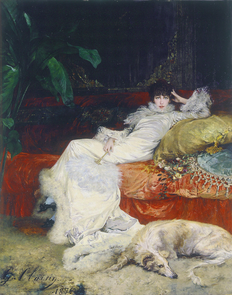
The portrait of Sarah Bernhardt, an excellent composition from many points of view, finds its most apparent balance on either side of the sinuous line of light through the center. This painting is exhibiting the axis, which many pictures show in varying degrees. The opposing corners are well balanced, the plant on one side of the axis versus the dog on the other side of the axis, with a trifle too much importance left to the dog. Place a finger over the head and forelegs of the dog, taking this much off and the whole composition gains, not only because the diagonal corners then balance, but because the heads of both woman and dog are too important for the same side of the picture.

It would be perfectly possible in the more complete composition to have both heads as they are, but this would demand more weight on the other side; or a shifting of the whole picture very slightly toward the left side. In the painting this is not felt, as the head of the dog is so treated that it attracts only a little, even though the object is in the close foreground.

This picture also balances on the horizontal and vertical lines. Here we have the dog and fan (in her right hand) balancing the body and plant. The balance across the diagonal of the figure, by the opposition of the dog with the plant is very complete. Joined with the hanging lamp above, this sinuous line effects a letter S or without the dog and leaf Hogarth’s line of beauty. (more on Hogarth’s line later)

In the matter also of the weakening of the necessary foundation lines which support the figure (the sofa), and cut the picture in two, this curving figure, the pillow and the large leaf do an excellent job.

When one fills a vase with flowers he aims at both unity and balance. If in either color combination, or in massing and accent, it lacks unity and balance, the result is disturbing. If we change the vase into a bowl then tip the bowl turned onto its side so that it resembles a frame around the bouquet and we still will attempt to find unity and balance. To be effective in a frame, balance and unity are just as necessary. The eye finds repose and delight in the perfect equipoise of elements, brought into combination and bound together by the girdle of the frame.

A picture should be able to hang from its exact center. Imperfect composition makes the viewer accommodate the imperfection by tilting the head to the false angle of the picture. Pictures that stand the test of time do not demand astigmatic glasses. We view them balanced, and they repeat the countersign—“balanced.”

After settling upon this as the great consideration in the subject of composition and reducing the principle to the above law, I confess I had not the full courage of my conviction for a six months. Every now and then a picture would appear that at first glance seemed like an unruly colt, to refuse to be harnessed to the theory and was in danger of kicking it to pieces. After a number of such apparent exceptions and the ease with which they submitted to the test of absolute balance from the center, on the scheme of the steelyards, I am now entirely convinced that what writers have termed the “very vague subject of composition,” “the perplexing question of arrangement of parts,” etc., yields to this simplest law, and which, in its directness and clearness, affords the simplest of working rules. Those whose artistic freedom bids defiance to the slavery of rule, as applied to an artistic product, and who try to produce something that shall break all rules, in the hope of being original, spend the greater part of the time in but covering the surface so that the principle may not be too easily seen, and the rest of the time in balancing the unbalanced.
As the balance of the figure dominates all other considerations in the statue or painting of the human form, so does the equipoise of the picture, or its balance of parts, become the chief consideration in its composition. The figure balances its weight over the point of support, as the flying Mercury on his toes, the picture upon a fulcrum on which large and small masses hang with the same delicate adjustment.


In Fortuny’s “Connoisseurs,” the two men looking at a picture close to the left of the center form the subject. The dark mass behind them stops off further penetration in this direction, but the eye is drawn away into the light on the right and seeks the man carrying a portfolio. At his distance, together with the lighted objects he easily balances the important group on the other side of the center. Indeed, with the attractiveness of the clock, vase, plaque, mantel and chest, his face would have added a grain too much, and this the artist happily avoided by covering it with the portfolio.

Pictorial Composition and the Critical Judgment of Pictures – Chap III (post 1)

This book, Pictorial Composition and the Critical Judgment of Pictures, by Henry Rankin Poore and written in 1903 is one of the most brilliantly written books I have come across. It is a subject about which many artists lack knowledge and thus struggle with their work, simply because it was information they were never taught. The book was originally written in 1903 and was written with a more eloquent and decorative speech, which many folks may find difficult to wade through. I will be attempting to translate the dialogue in the book into something you may find easier to read – hopefully without losing too much in the translation. It is a book you can find on-line or as an E-book. Some of the pictures he references in the book I will try to re-source since the scans of the original may be suboptimal to observe what he is talking about.

CHAPTER III – BALANCE

Of all pictorial principles none compares in importance with Unity or Balance.

Why all this intense striving, this struggle to a finish,” said George Inness, as, at the end of a long day, he flung himself exhausted upon his lounge, “but an effort to obtain unity, unity.”

Someone who watches an artist at work at his easel will notice how the artist is always trying to see his work in a novel and unusual way. He’ll reverse the image in a mirror, turn it upside down, view at different distances, add or subtract accents, or place dots of color variously around the painting. The artist is thoughtfully weighing the different parts in the slowly growing mosaic. He works under the restraint of a law which he feels compelled to obey, the law of balance. It is a fundamental principle, no matter the style or type of work, so his esthetic sense forces the artist to adjust the piece to so that it will comply with his ideas of balance.

We can subject pictures to a simple test. This test works even if we take the good words by artists who have said composition doesn’t matter. Find the actual center of the picture and draw a vertical and horizontal line through it. The vertical division is the more important, as the natural balance is on the lateral sides of a central support. It will be found that the actual center of the canvas is also the actual pivot or center of the picture. Around the center point the various components of the picture will group themselves, pulling and hauling and warring for attention. The satisfactory picture showing as much design of balance on one side of the center as the other, and the picture in complete balance displays this equipoise above and below the horizontal line.

Every item in a picture has a certain positive power, as if each object were a magnet of a given strength. Each item has two characteristics. Each object has a certain amount of attraction for the eye, and it also has a proportional detraction of every other part. The more you notice an object in the picture, the less you notice anything else in the picture.

The term “Steelyard” refers to a steelyard balance. This type of balance or scale is able to use a small weight at a distance along a lever to a fulcrum to counterbalance a larger weight.

Steelyard balance

By moving the counterweight along the arm, you use the power of the lever to offset increasingly larger weights.

So for the principle of the steelyard, the farther from the center and more isolated an object is, the greater its weight or attraction.

Therefore, when using the steelyard, the balance of a picture you will find that a large object placed a short distance from the center will be balanced by a very small object on the other side of the center and further away from it. The whole of the pictorial interest may be on one side of a picture and the other side might be practically useless as far as picturesqueness or some story-telling possibility is concerned, but the purpose of its existence is only to act as the balance and for no other reason.

In the emptiness of the opposing half such a picture, when completely in balance, will have some bit of detail or accent which the eye in its circular, symmetrical inspection will catch, unconsciously, and weave into its calculation of balance. If not an object or accent or line of attraction, then some technical quality, or spiritual quality,  for example, a strong feeling of gloom, or depth for penetration, light or dark, a place in fact, for the eye to dwell upon as an important part in connection with the subject proper, and recognized as such.

One may wonder, if all the subject is on one side of the center and the other side depends for its existence on a balancing space or accent only, why not cut it off? Do so. Then you will have the entire subject in one-half the space to be sure, but its harmony or balance will depend on the equipoise when pivoted in the new center.