
In this section of Practice and Science of Drawing, for this post there isn’t a lot to add, nor explanations to expound upon. At the end I will touch again on some things which I found the most interesting. He is so clear in this text that when you read it, there will be an understanding as like a crack of thunder.
There are many different methods of drawing in line, and a student of any originality will find one that suits his temperament. But I will try and illustrate one that is at any rate logical, and that may serve as a fair type of line drawing generally.
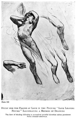
The appearance of an object is first considered as a series of contours, some forming the boundaries of the form against the background, and others the boundaries of the subordinate forms within these bounding lines. The light and shade and differences of local colour (like the lips, eyebrows, and eyes in a head) are considered together as tones of varying degrees of lightness and darkness, and suggested by means of lines drawn parallel across the drawing from left to right, and from below upwards, or vice versa, darker and closer together when depth is wanted, and fainter and further apart where delicacy is demanded, and varying in thickness when gradation is needed. This rule of parallel shading is broken only when strongly marked forms, such as the swing lines of hair, a prominent bone or straining muscles, etc., demand it.
This parallel shading gives a great beauty of surface and fleshiness to a drawing. The lines following, as it were, the direction of the light across the object rather than the form, give a unity that has a great charm. It is more suited to drawings where extreme delicacy of form is desired, and is usually used in silver point work, a medium capable of the utmost refinement.
Lines drawn down the forms give an appearance of great strength and toughness, a tense look. And this quality is very useful in suggesting such things as joints and sinews, rocks, hard ground, or gnarled tree-trunks, etc. In figure drawing it is an interesting quality to use sparingly, with the shading done on the across-the-form principle; and to suggest a difference of texture or a straining of the form. Lines of shading drawn in every direction, crossing each other and resolving themselves into tone effects, suggest atmosphere and the absence of surface form. This is more often used in the backgrounds of pen and ink work and is seldom necessary in pencil or chalk drawing, as they are more concerned with form than atmosphere. Pen and ink is more often used for elaborate pictorial effects in illustration work, owing to the ease with which it can be reproduced and printed; and it is here that one more often finds this muddled quality of line spots being used to fill up interstices and make the tone even.
Speaking generally, lines of shading drawn across the forms suggest softness, lines drawn in curves fullness of form, lines drawn down the forms hardness, and lines crossing in all directions so that only a mystery of tone results, atmosphere. And if these four qualities of line be used judiciously, a great deal of expressive power is added to your shading. And, as will be explained in the next chapter, somewhat the same principle applies to the direction of the swing of the brush in painting.
Shading lines should never be drawn backwards and forwards from left to right (scribbled), except possibly where a mystery of shadow is wanted and the lines are being crossed in every direction; but never when lines are being used to express form. They are not sufficiently under control, and also the little extra thickness that occurs at the turn is a nuisance.
The crossing of lines in shading gives a more opaque look. This is useful to suggest the opaque appearance of the darker passage that occurs in that part of a shadow nearest the lights; and it is sometimes used in the half tones also.
First I should define “hatching”. It is what Harold Speed calls ‘Parallel Shading’. Below you’ll see two of the styles of hatching (done rather quickly and without much care). On the Right is hatching; on the left is cross-hatching. Let’s talk about the hatching first.
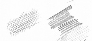
Fig. 1 Cross hatching (Left) and Hatching (Right)
If you notice there is a variation in the weight of the line in the hatching, and also in the spacing of the line. The line thickness can also vary in weight – from thicker to thinner as the line is drawn. This gives you a great deal of variety in the way you shade an object.
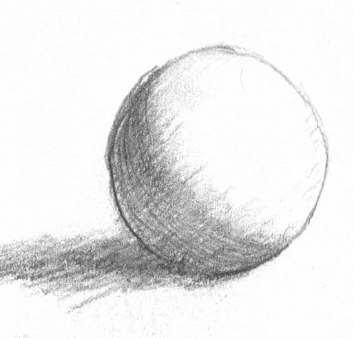
ball with cross hatch, hatch
The cross hatch, is usually done at 90 degrees to the initial line, but here I have shown it at a slight slant. The thing to notice with a cross hatch is all of the pure white paper between the lines. This whiteness gives a luminosity to the shadow area, imitating reflected light better than a full scribbled shading.
To the right, you see how this comes into play. notice how the shadow has a luminosity to it. The pure paper showing between the cross hatch reflects the pure light giving a luminosity to the shadow. This is due to the light hitting white paper and not gray graphite if I had a shading of the whole paper. Those pin point white spots reflect a purer light than the graphite.
“The lines following, as it were, the direction of the light across the object rather than the form, give a unity that has a great charm.”
Due to the very curved surface of a sphere, I drew the ball with the curve to the cross hatch to emphasize the roundness of it’s surface.
This is an interesting idea on hatching. Where the lines are crossing the turn of a form, is where the hatching will occur. This doesn’t mean you necessarily have to draw the hatching with a lot of vigor. Sometimes the hatching is so lightly done and so closely spaced as to seem to be just shading, but thin stripes of white paper will show through.

Fig 2. Exercise in hatching
To the Left is a drawing I did as an exercise in hatching. (there is a bit of cross hatch here and there) In this parallel shading technique, all the shading is done with the parallel line moving from lower left to upper right because I am right handed. I could have gone the other direction, but because the hair is sloped at an angle I chose this direction. I didn’t struggle to match the tone of the skin, just enough shading to turn the form.
